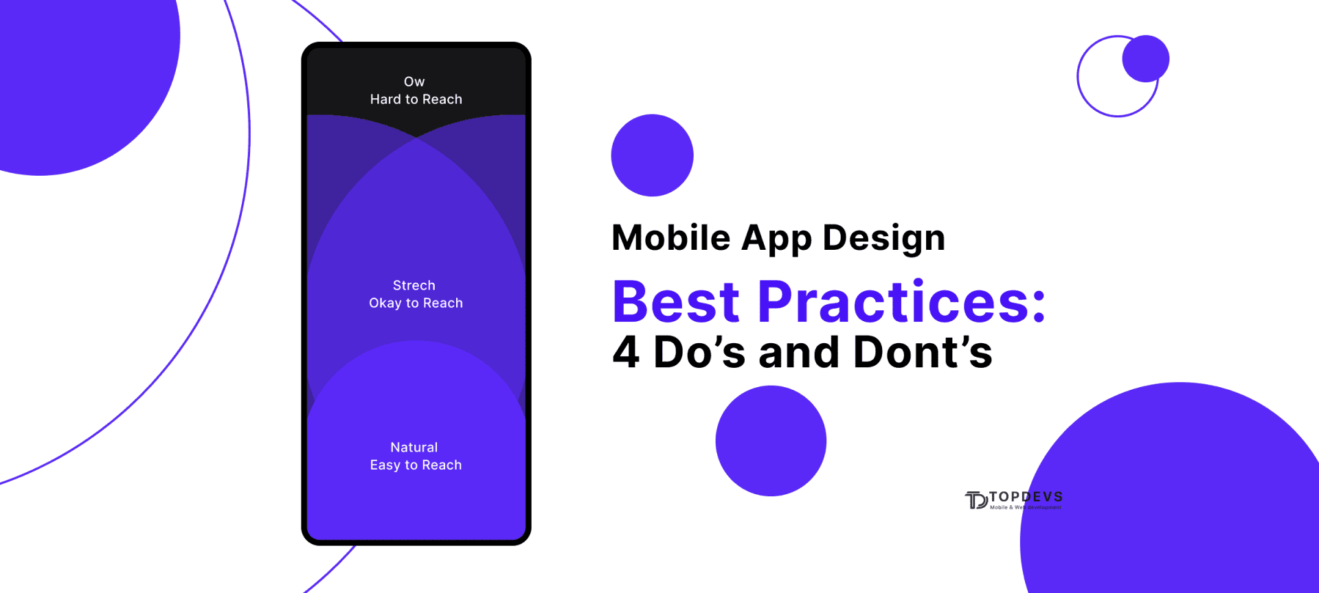
Mobile App Design Best Practices: 4 Do’s and Dont’s
Mobile app design has a big role in shaping the user experience. Despite the fact that the design is always the author's idea, there are certain recommendations regarding the design of applications. In this article, we will look at the main ones, using our expertise and experience.
What Is Mobile App Design?
The concept of mobile app design Android or iOS includes user experience (UX) and user interface (UI). If the interface is about what style the application has: colors, fonts, and so on; the job of UX is to provide actual functionality and usability.
Even the best app idea can fail and leave the user unsatisfied. Using the resources of developers to improve both parameters is the key to a successful application with high audience loyalty.
Any application, like a product, must solve certain user problems. To do this, it is important to conduct research and highlight the shortcomings of competitors, improving your author's offer to the audience. The value of the application is exactly the factor that will affect the final impression and long-term use.
So, the information architecture should be combined with the user's mindset, he should get what he expects. For example, a red exit button is a violation of the user's logic. Also, keep in mind the variety of devices your audience uses.
Essential Patterns of Mobile Navigation

Despite the creativity in the approaches, there is a generally accepted list of recommendations that should be followed.
1. Hamburger menu
This is the best solution for limited space. It also helps to hide complex navigation and, thanks to the popularity of the design, quickly gets to grips with the application.
2. Top and bottom navigation
At the top are the most important links for managing the application. Below are additional navigation links. Since the phone is held with one hand, the ability to control the application from the bottom of the screen is a big advantage.
3.UI Cards
They can have a different appearance and appearance, but to a large extent help to personalize the content and the application in general. Another advantage of cards is that they adapt to the screen size.
4. Tabs
The tab is essentially an addition to the navigation bar, they even use the same layout. The difference from navigation is in a general theme, such as the Home and Favorites buttons.
5. Gesture based navigation
A vivid example of such navigation is swipes in the Tinder app. This greatly improves the user's dynamic experience and attracts interactivity.
6. Full-screen navigation
Most designs aim to minimize the use of space. Sometimes a whole screen is even allocated for navigation to unload the user.
Peculiarities in Designing for Various Mobile Platforms
Let's take a look at some of the best design practices to improve user experience. Consider a few popular platforms that are constantly refining their design.
1. Meta (Facebook)
One of the features of the platform is mobile navigation. All the classic tricks are here: hamburger menu, top and bottom navigation bar. Proper distribution of the load on the user can improve the impression of using the application. In addition, there is consistency throughout the application and constant optimization of the interface.
2. Spotify
This is the best example of using UI cards in an interface. The cards here are a dynamic way to find the information you need. Thanks to the competent use of cards, user involvement in the platform and its content increase. It also uses the bottom navigation bar.
3.App Store
Apple as a whole pays a lot of attention to improving the user experience. In the case of the App Store, there's also a great example of using tabs to enhance mobile navigation. Also, thanks to the different types of tabs (for example, "Paid" and "Free"), users increase the satisfaction of using the platform. There is also a bottom navigation bar.
Read also: How to Track Your Customer Behavior Through a Mobile App
What Tools to Use for Mobile Design

There are many tools that help create the perfect design for a mobile application. Let's look at the main ones.
Sketch
The optimal solution for wireframing and user interface design. The main advantage of the service is simplicity and great opportunities. There are also a number of possibilities for implementing a high-quality user interface: layout settings, text and layer styles. The program is often referred to as a hybrid between Adobe Photoshop and Illustrator.
InVision App
With this application, you can create an interactive layout of the application. This helps to visually understand the interaction of the user with the application. This is especially true for web applications, because prototyping takes place very quickly here. Another advantage is the ability to convey the designers' vision to other team members and the client.
Marvel app
Here you can simply and effectively design, make a frame and a prototype. Thus, a representation of the interaction in the user interface is compiled. The service is compatible with Sketch and Adobe Photoshop and also syncs with Google Drive and Dropbox. In addition, offline work is available.
Figma
This platform features multi-access editing and excellent compatibility with different operating systems. The service can also compile a library of project components.
Zeplin
Basically, it's an environment where developers and designers can collaborate and connect. Here you can export projects from Sketch, Adobe XD, Figma, Adobe Photoshop through plugins. Here you can also create code, which further optimizes processes.
Mobile App Design Process in Details
Creating an application design is a long multi-level process. We have already described the main software for this, now we will briefly describe the main stages of development.
App design checklist:
- Designing user-flow for each screen: what exactly this screen should convey to the user.
- Drawing screen thumbnails (wireframes): what the main components of the interface will look like.
- Selection of style patterns and color palette: everything should be in harmony and blend with your brand book.
- Prototyping and mock-ups: collect all the ready-made ideas and screen transitions.
- Gathering an interactive prototype of the application and collecting the first feedback: you can involve not only testers but also ordinary employees of your company.
- Final touch-up of the prototype: polish all the screens, as the actual development of the application, follows.
4 “Dont's” When Designing a Mobile Application
Consider the main prohibitions on the formation
1. Don't try to be perfect the first time.
Most likely, the requirements will change during the development process. In order to save time and money, we recommend not to start the design process building an application, but focusing on prototypes and MVP. An iterative way of designing will help to avoid mistakes.
2. Don't design in isolation
In the absence of real feedback and data analytics, real understanding of the market is lost. Test your hypothesis with a focus group of your target audience.
3. Don't ask for tracking and notification permissions from the start
All requests must be received on time and appropriately. The user must have a context in which he consents to the processing of information.
4. Don't Make Dead End Pages
Since it is the job of the application to keep the flow going, creating dead ends is to block the flow. It can also confuse the user.
4 Best Practices of Truly Appealing Mobile Design

Tips to follow in the development process.
1. Always Test Your Design
Bugs can occur at any stage of development, and besides, the design looks different on different screens. Don't release the app without testing. Your application must adapt to change.
2. Make text legible
Everything should be readable and understandable, for greater convenience it should be possible to increase the size of the font and icons. The best solution is to rely on the platform default font.
3. Create touch points that are comfortable for your fingers
You should avoid user errors caused by small icon sizes or small spacing between buttons. The controls must be at least 7–10 mm.
4. Create a hassle-free experience
Since each user has at least two types of devices, this must be taken into account. Synchronize the application and do everything so that the user does not notice the difference whether he uses a phone or another device.
Best App Design With TopDevs Team
TopDevs has a deep expertise in implementation design solutions for companies of various types. We offer a clear positioning of your brand in the market, which has a positive effect on conversions.
What do we offer:
- branding and identity;
- prototype development;
- UX design;
- user interface design.
We work both with your ideas and develop ideas for you. You can learn more about our service and see examples from the portfolio on our website.
Our skills in design were approved by Behance service
.It collects the most prominent pieces of app design examples for business.
How Much Does Mobile Design Cost?
The price for mobile design can cost anywhere from $3,000 to $30,000. The main factors that affect the cost are the complexity of the application idea, the type of team, and the location of the team.
It should be noted that the simplicity of the design should not exclude usability and overall attractiveness. As for the formats of cooperation, outsourcing from Eastern Europe is considered the most optimal.
Summary
The expectations of people from mobile applications are growing every year. The task of the developer is to provide the user with a positive experience. The application must have value, not only attracting, but also retaining the user.
Think like a user, research your audience, create prototypes and constantly improve your product. Only by being sure that you yourself are comfortable using the application, you can give guarantees to the user.
Your idea - our execution. Let's create meaningful solutions together!
Contact ustags